From entertaining to buying …
Life Of Colour Boutique Supplier of Unique & Modern Art
Transitioning website visitors from passive enjoyment to active purchasing by streamlining the shopping process and driving conversion rate.
-
Team
Soudeh Geranpayeh, UX consultant
Patrick Ferguson, UX consultant
-
Duration
3 weeks
-
Tool
Figma
Miro
Summary
-
Project overview
Life of Colour is a Sydney-based online supplier of art products that has grown significantly since its inception about five years ago. Initially starting as a single-product company focusing on paint pens, it has since expanded its offerings to become a comprehensive provider of creative experiences. Each new addition to the product range is designed to seamlessly complement and build upon the previous products, creating a cohesive and integrated experience. The company's mission is to encourage people to take a break from their busy lives and screens, fostering quality time with family through creative activities.
-
Problems
Despite the significant evolution of the product range and brand identity, the current website fails to effectively showcase the breadth and depth of its offerings. This results in missed opportunities to engage and convert visitors beyond their initial intent.
-
Our objectives
Our team's objective is to uncover as much as we can about the users' behavioural patterns and pain points to make suggestions for improvements to the current site. We aim to transform the Life of Colour website into a dynamic and user-centric platform that not only educates and entertains but also effectively drives conversions and maximizes the potential of their product range.
What are the client's objectives?
Increased conversion rate
Increased user awareness of the product range.
Maximize the collection of visitor email addresses for targeted marketing efforts.
Our client is looking to implement minor adjustments rather than major ones to obtain the above goals due to the constraints of the Shopify platform, which has limitations because it's a hosted platform with predefined templates and functionalities that restrict extensive structural changes.
The kick-off
Understanding the research
At the outset of the project, the client provided us with key aspects of their traffic and user behaviours:
Traffic sources: paid ads and organic visitors.
The behaviour of paid ads traffic: primarily buys the advertised product, seldom purchases other items.
Website usage: 30% of all traffic to the website is to visit their blog rather than for purchasing reasons.
70% of traffic comes from mobile devices.
Strategic research focus
Enhancing Mobile Website Experience for Key User Journeys
In the initial phases of our research, we emphasized the importance of optimizing the mobile website experience, given that a significant 70% of our website traffic originates from mobile devices. We further refined our research by concentrating on the two primary pathways of the website:
1. Product pathway: Within this journey, users explore the product range, select a specific item, and proceed with the purchase process.
2. Blog pathway: This pathway entails users navigating from the home page to a blog article, subsequently discovering and purchasing a product featured within the blog.
Heuristic evaluation of the key pathways.
To understand how the Life Of Colour website can be improved, our team conducted an expert review, assessing specific attributes of the user experience against a set of predetermined design principles.
In the table below, you can see the areas that need improvement following the heuristic evaluation.
HEURISTIC OF PRODUCT PATHWAY
HEURISTIC OF BLOG PATHWAY
Exploring competitors' strategies
We dove deep into understanding what makes our competitors successful in driving sales, boosting product awareness, and building email lists for marketing. This exploration shed light on their tactics and uncovered valuable insights that could benefit our client.
We took a closer look at key players in our industry, including:
1. Mont Marte
2. Poscart
3. Eckersley
By unravelling these success stories, we're not just mimicking our competitors but understanding what truly resonates with our audience and how we can craft a unique strategy for our client's success.
Who are we designing for?
During our initial discussions with the client, combined with their firsthand experiences and research insights, along with user testing and our investigations, we identified two primary target user groups.
Art Enthusiasts: People who purchase art supplies for themselves as a creative outlet.
Family Creators: Individuals who buy art supplies for children or grandchildren.
Crafting target user scenarios for deeper understanding
We placed them in real-world scenarios to gain a deeper understanding of our target users, including their goals, needs, and challenges. This approach helps us empathize with their experiences and ensures our solutions are tailored to meet their specific requirements.
Now that we have a clear understanding of our users, their needs, and their goals, let's gain insights by walking through the expected user experience.
Discovered pain points on the current site
Lengthy and unorganized product descriptions: The product descriptions on the product page are lengthy and not well-organized, making it difficult for users to quickly scan and prioritize the information they need.
Overwhelming shopping process for featured products on the blog page: The shopping process for featured products presented on the blog page is overwhelming. Customers need to navigate back and forth between the blog page and the product page, which leads to confusion and frustration, often causing them to leave the page.
Inconvenient add-to-cart process: Customers are unable to add products directly to their cart from the product range page; instead, they must navigate to the individual product page to do so. This extra step is inconvenient, requiring more time and clicks, leading to a less streamlined shopping experience.
Proposed Solutions
Accordion function for product descriptions
Implementation: Integrate an accordion function into the product descriptions. This will organize the large amounts of information in a compact space.
Benefit: Makes it easier for users to navigate and find the information they need without being overwhelmed by too much visible content at once.
2. Direct add-to-cart feature for blog products
Implementation: Add functionality that allows users to add the products mentioned in the blog articles directly to their cart from the blog page. Offer options to add all the products as a bundle or individually.
Benefit: Streamlines the shopping process by reducing the need to navigate back and forth, enhancing user convenience and reducing frustration.
3. Plus button on the product range page
Implementation: Include a plus button (+) on the product range page that enables users to add a product to their cart without needing to visit the individual product page.
Benefit: Simplifies the shopping process by allowing users to add products with fewer clicks, saving time and improving the overall shopping experience.
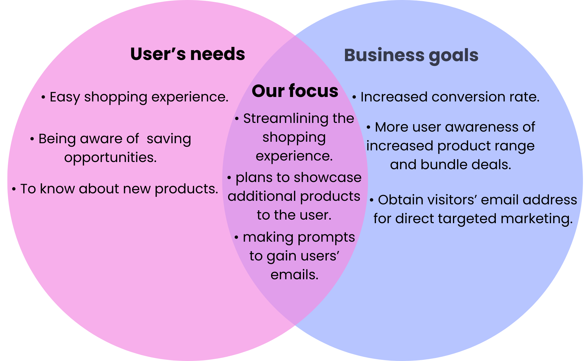
Finding the bridge between the business and users
To create an experience that benefits both the client and the user, our team identified the needs of both the business and the user based on conversations with stakeholders, research, and usability testing.
After multiple conversations with the client, usability testing, research, and assessing the needs of both the business and the user, we have identified some key insights that will guide our proposed solutions. Given the project's time frame, we have prioritized the most important and achievable solutions that benefit both the client's goals for an improved conversion rate and the user's needs for an enhanced experience.
Proposed strategies to meet people’s needs along with business goals
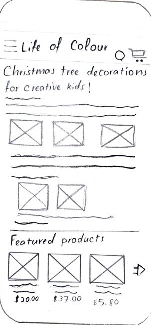
The Sketches
Product page
Adding the accordion function.
The inclusion of a related products section broadens the user’s scope of what they can purchase.
Product range page
Including the plus button signifies to the user that they can add a product to their cart and continue shopping.
Blog page
This featured product functionality allowed the users to add the products written about within the article to their cart directly from the page.
Make it a bundle function
Including the make it a bundle functionality on the product page.
User feedback and insights before prototype development
Before creating a higher-fidelity, clickable prototype, we gathered qualitative feedback from the client, potential users, and target users. This approach provided invaluable insights into their experiences with the current flows, enabling us to make necessary improvements.
We focused on two primary pathways:
Blog Pathway: Navigating from the home page to a blog article, followed by purchasing a featured product.
Product Pathway: Browsing the product range page, selecting a product, and completing a purchase.
Eight users were asked to compare the current and proposed sites. Each participant first navigated through both pathways on the current site and then repeated the process using the prototype, noting any areas they enjoyed or found challenging.
Key Takeaways:
Positive Feedback:
Add-to-Cart Functionality: Users appreciated the ability to add products directly to their cart from the product range pages, stating it would increase their likelihood of continuing shopping.
Bundle Opportunities: Users liked being informed about bundle deals earlier in the purchasing process, suggesting it would positively influence their decision to opt for bundle deals.
Featured Products on Blog Pages: Users found the inclusion of featured products on blog article pages seamless, indicating it would highly increase their chances of purchasing reading.
Suggestions for Improvement:
Add-to-Cart Button: Users found the plus button for the add-to-cart functionality confusing and recommended using a cart icon to make the action clearer.
Wireframes
After synthesizing the feedback received from potential users, our team produced annotated wireframes that detail how a user would progress through both proposed pathways. These wireframes incorporate the insights gained and illustrate the user journey improvements.
Key considerations
Identify the most popular blog articles to include the featured products component.
Ensure users have the option to opt out of the rewards/loyalty program to maintain user autonomy.
Next steps
Share the designs with the current web developer to assess the difficulty and feasibility of the proposed changes.
If implemented, monitor the conversion rate changes associated with key targeted pathways.
Consider expanding and increasing the number of bundle deals if the proposed functionality proves successful.


